This picture was taken of the church and graveyard in Morley. I decided to change it to black and white because i feel like it gives it a little more depth and makes the picture pop more. I really didn't like how the shadows of the trees were on the roof so I tried adjusting the highlights and shadows but it didn't help much.
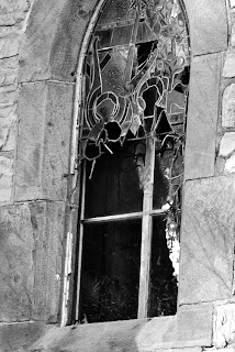
This is one of the stained glass windows that was on the side of the church, taken in auto mode.
This is one of my favorite pictures that I took. I really like how the stained glass window is broken and in black and white, it gives the picture a sort of spooky look.
This was my other favorite picture that I took. I really liked Michaela's pictures of the graveyard so I experimented a little. This was a picture that I thought would look better in black and white, however, I was surprised that looked the best in color. I think the color of the fallen leaves really makes the dark, dis-colored grave stone stand out.
This was a picture of the bell tower at the top, also looking much better in black and white. I also had to adjust the shadows and highlights.
This was a broken fence I saw leaving the church and I really liked the gothic and old feel it gave the church and graveyard.


No comments:
Post a Comment